Auctions Search System

A web application for the Russian b2b/b2g market that aggregates auctions published by state companies-customers and serves as a search and management tool for companies-suppliers.

Type

Long-term project, web application

Role

Lead UI/UX Designer

Timeline

Jan 2013–Mar 2018

Market

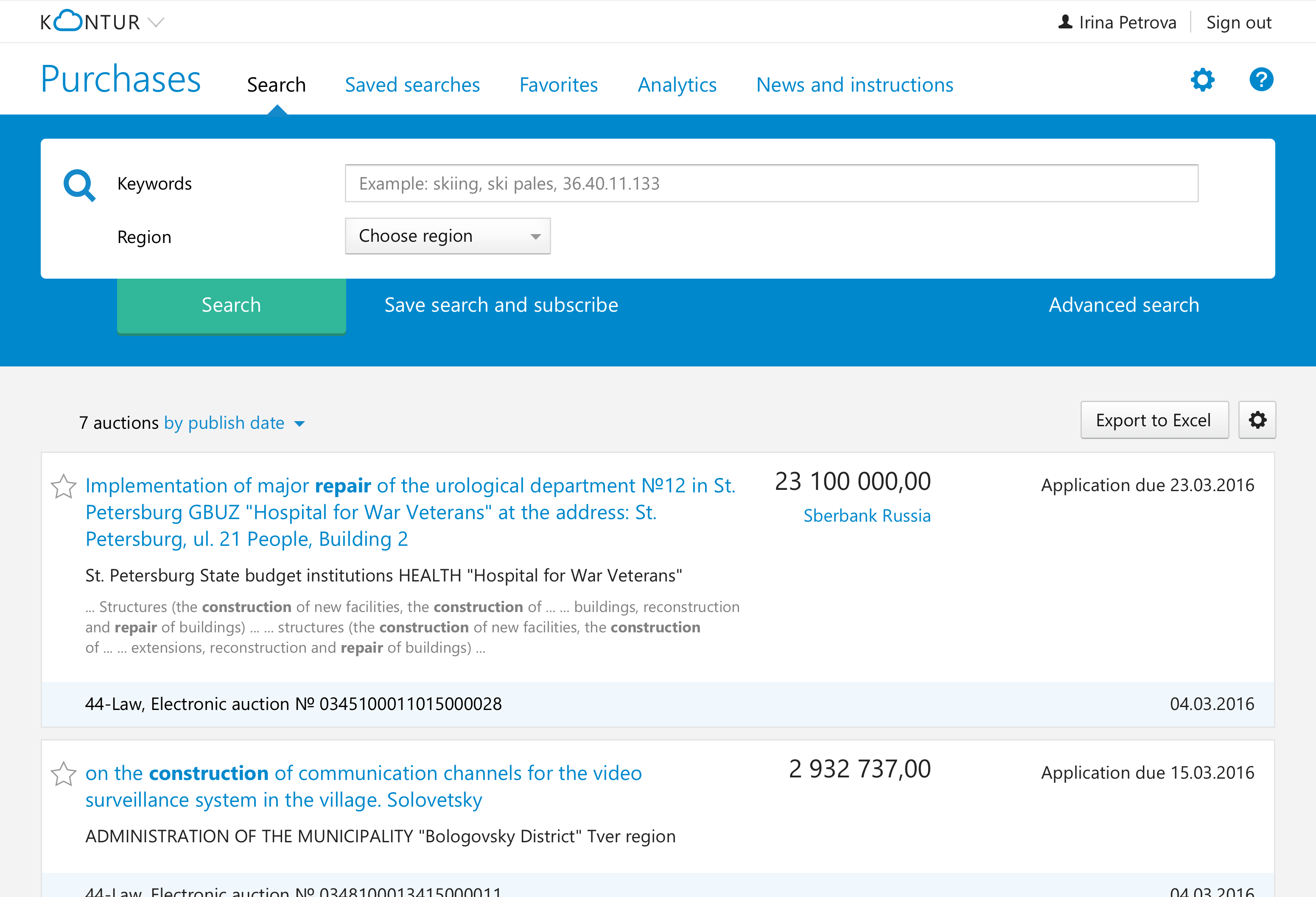
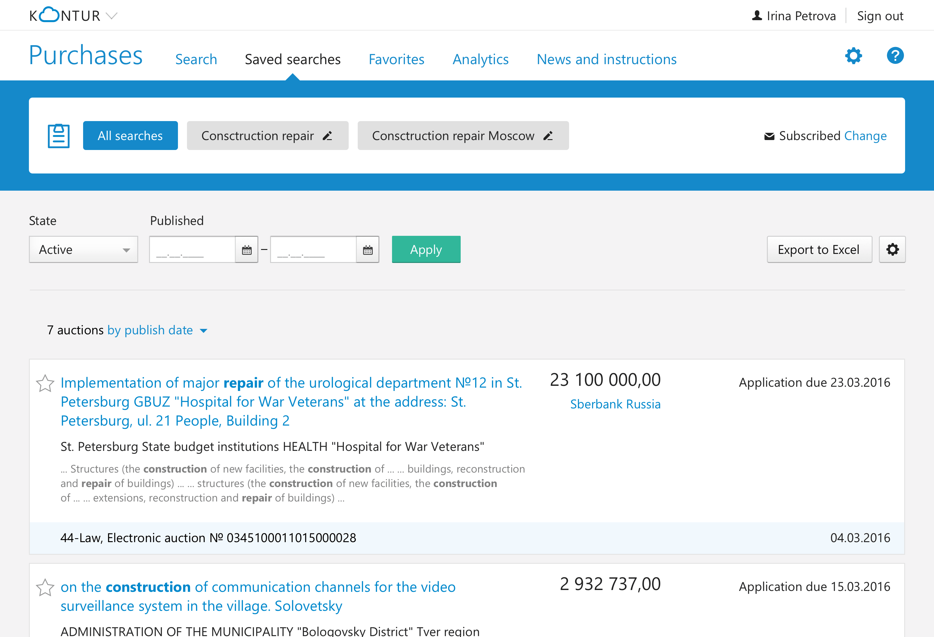
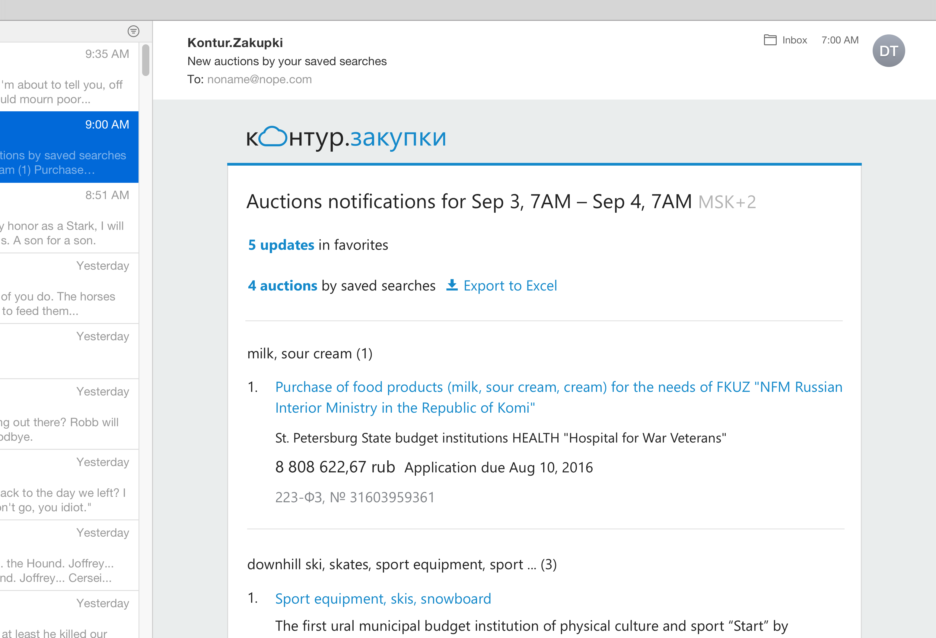
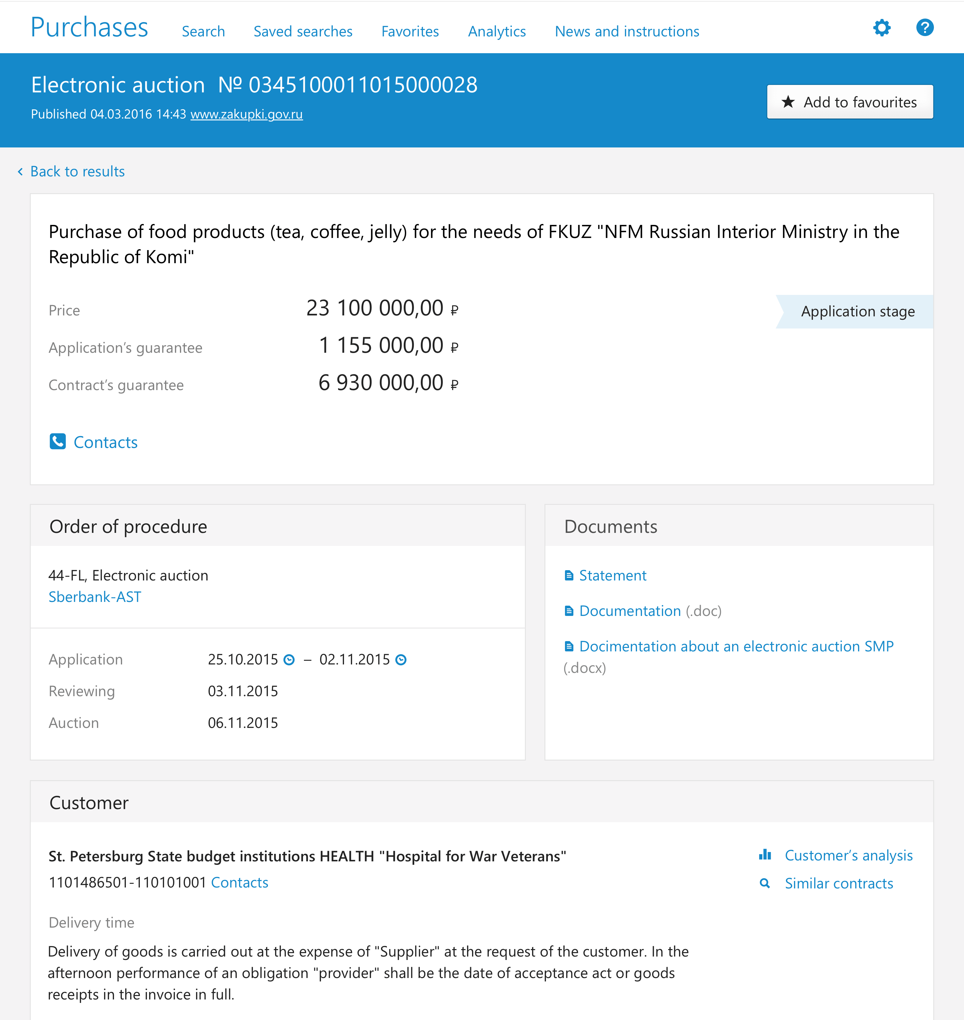
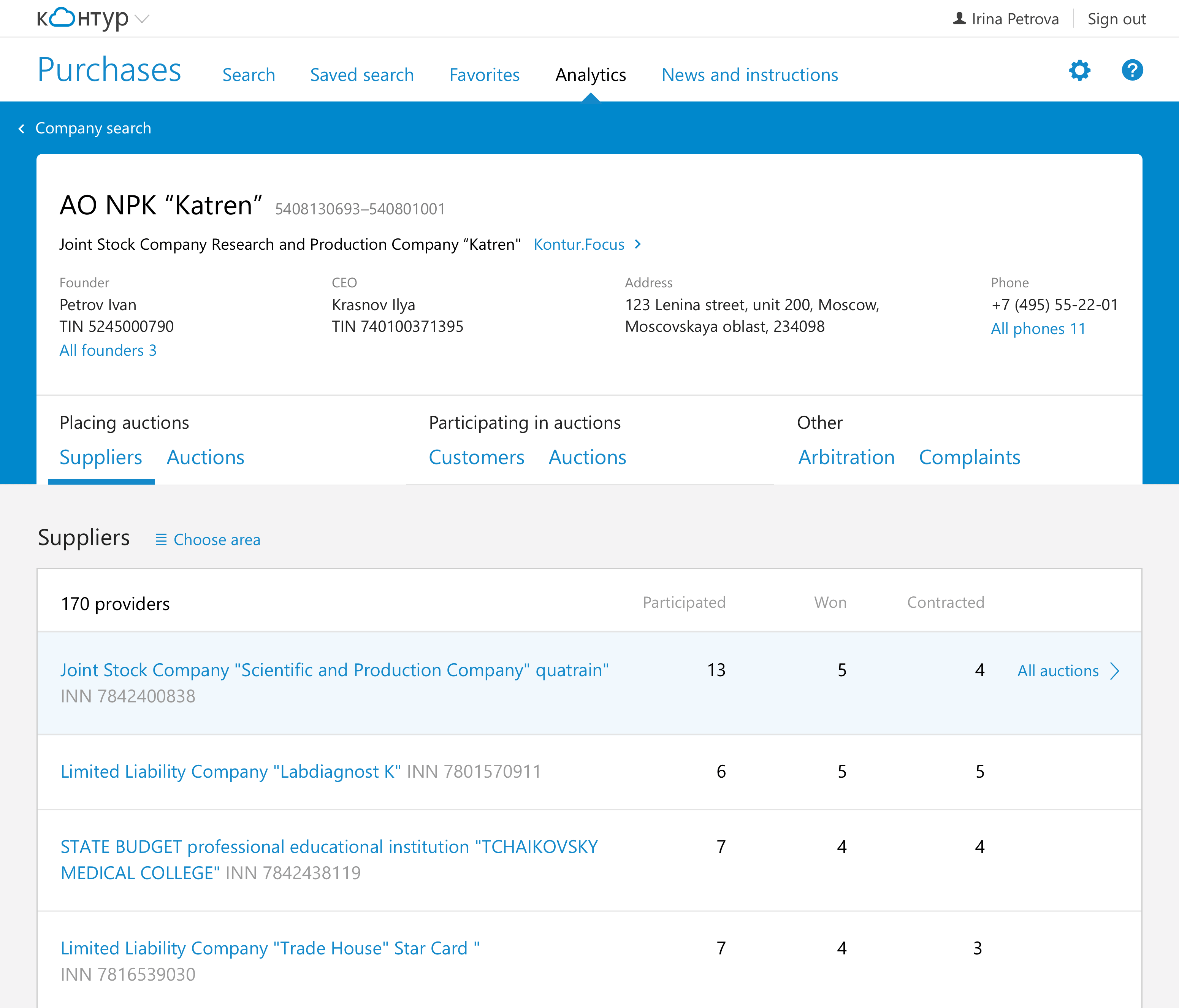
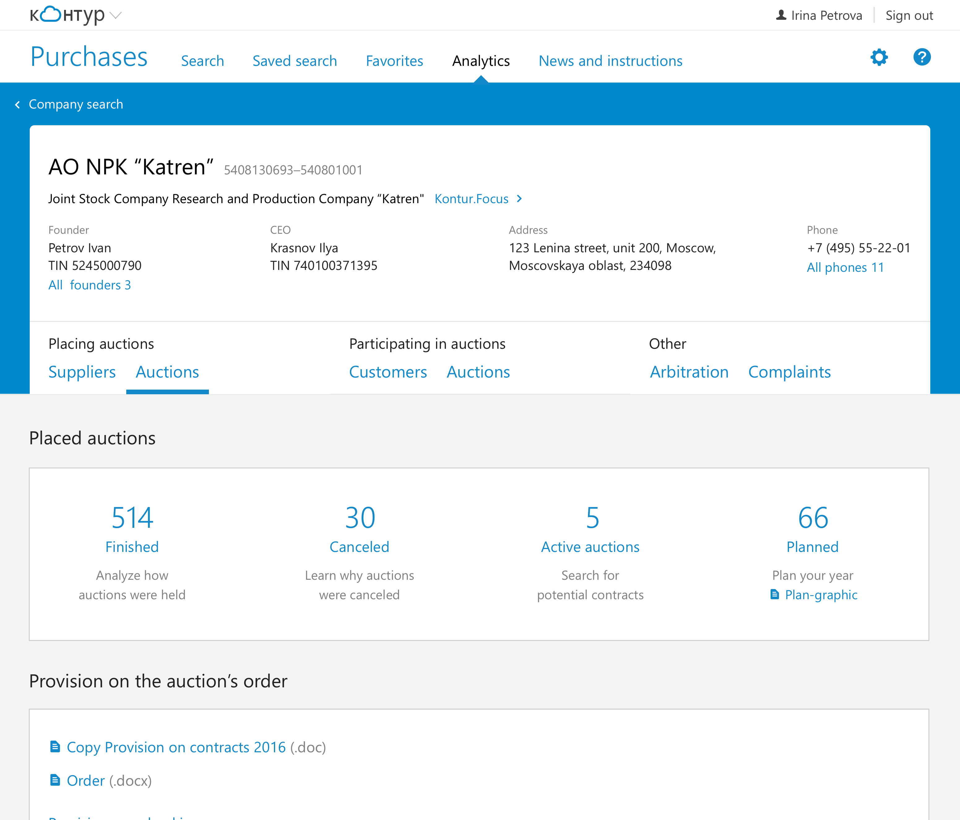
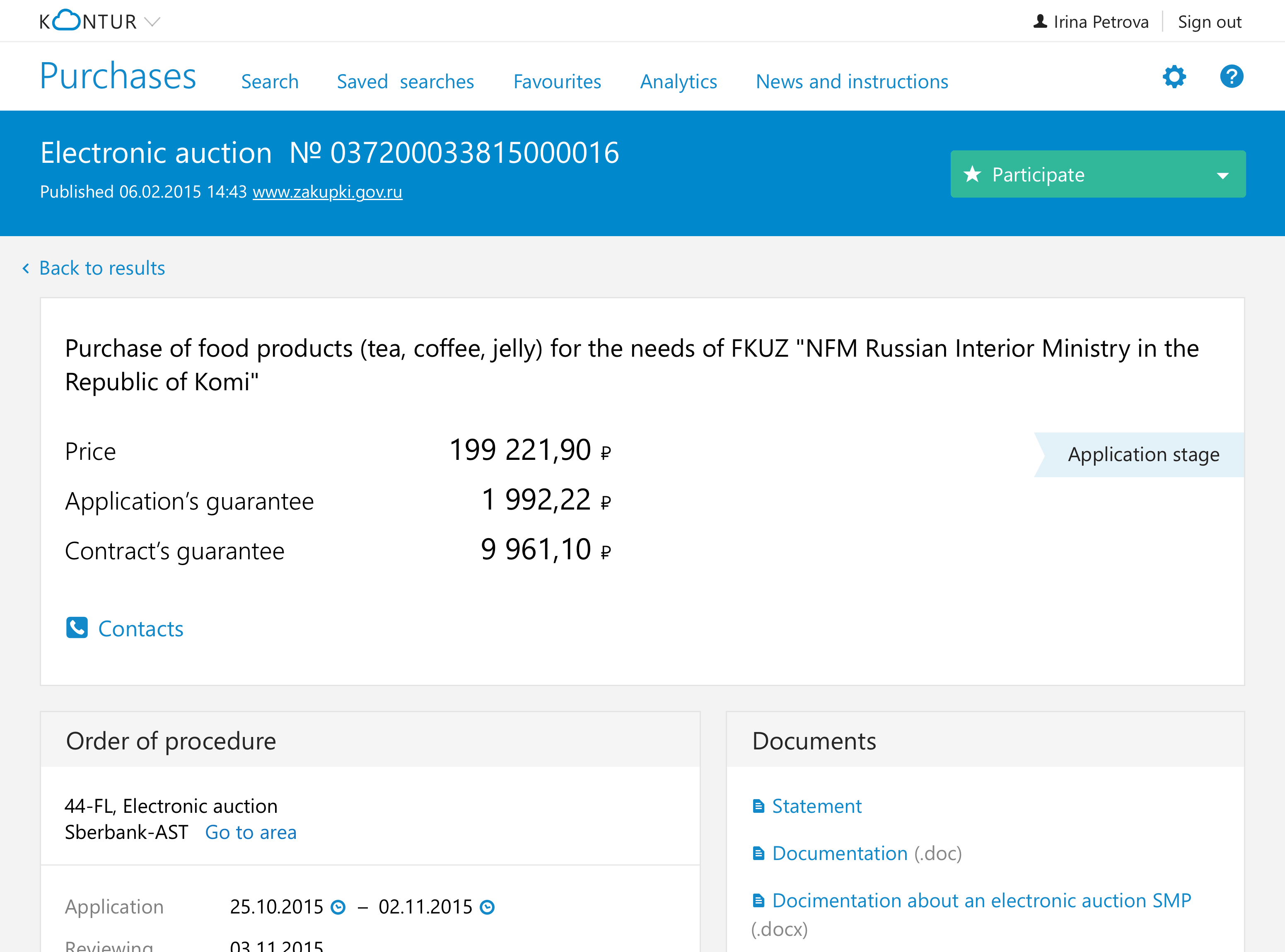
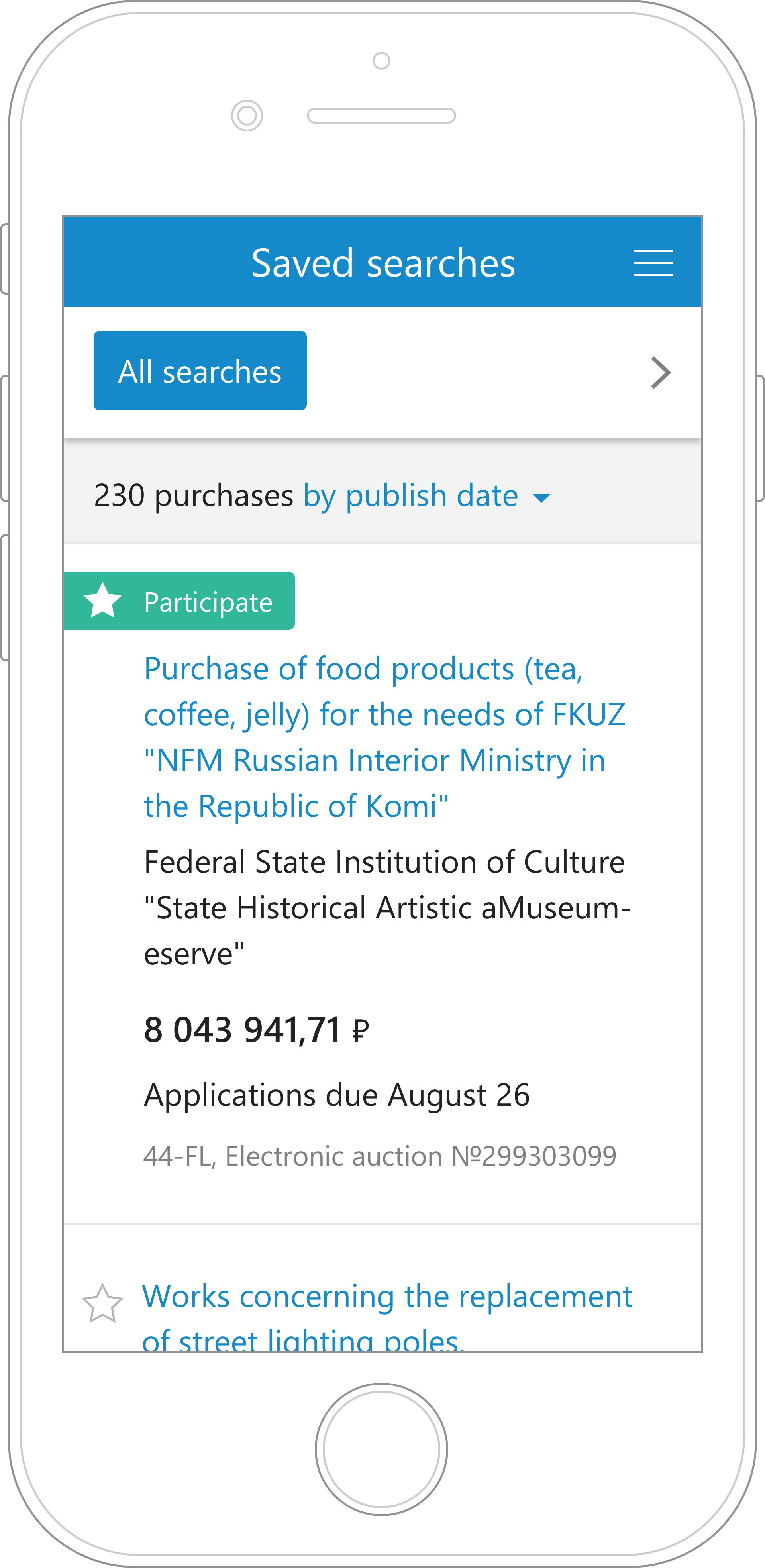
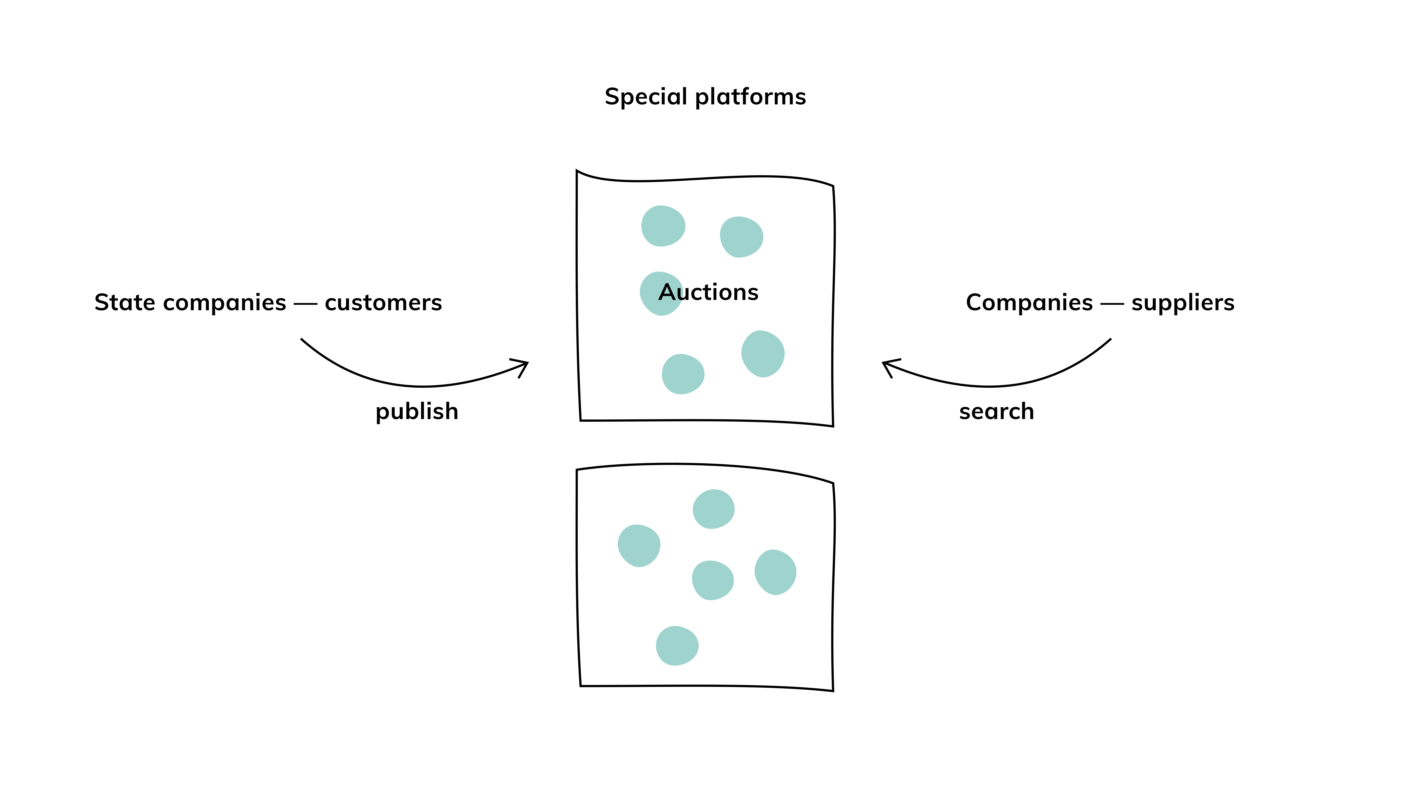
In Russia, state companies-customers are obligated to publish services and products they need on special platforms as auctions. Companies-suppliers search for those auctions to participate in them and win the contract.

Goal

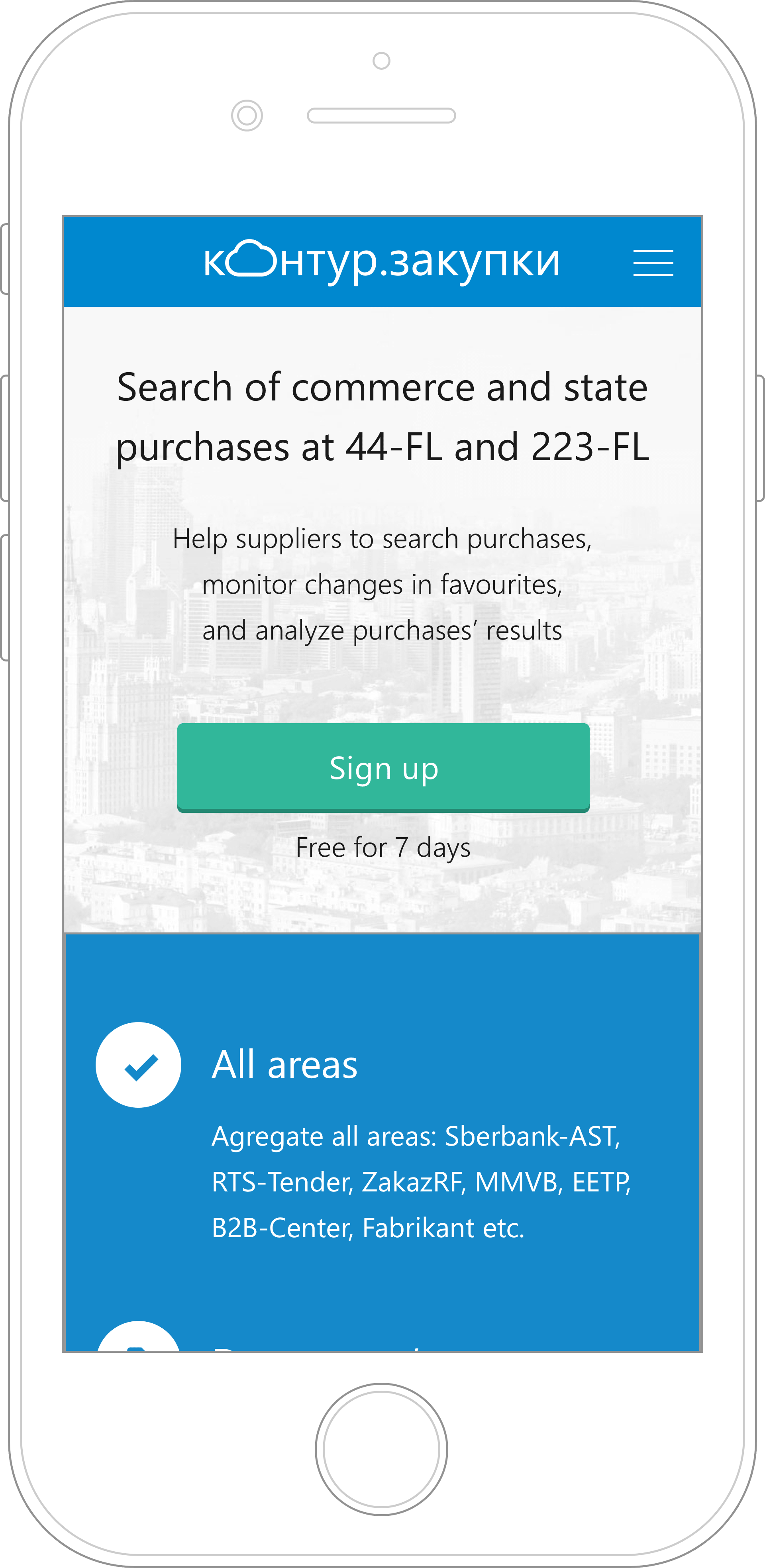
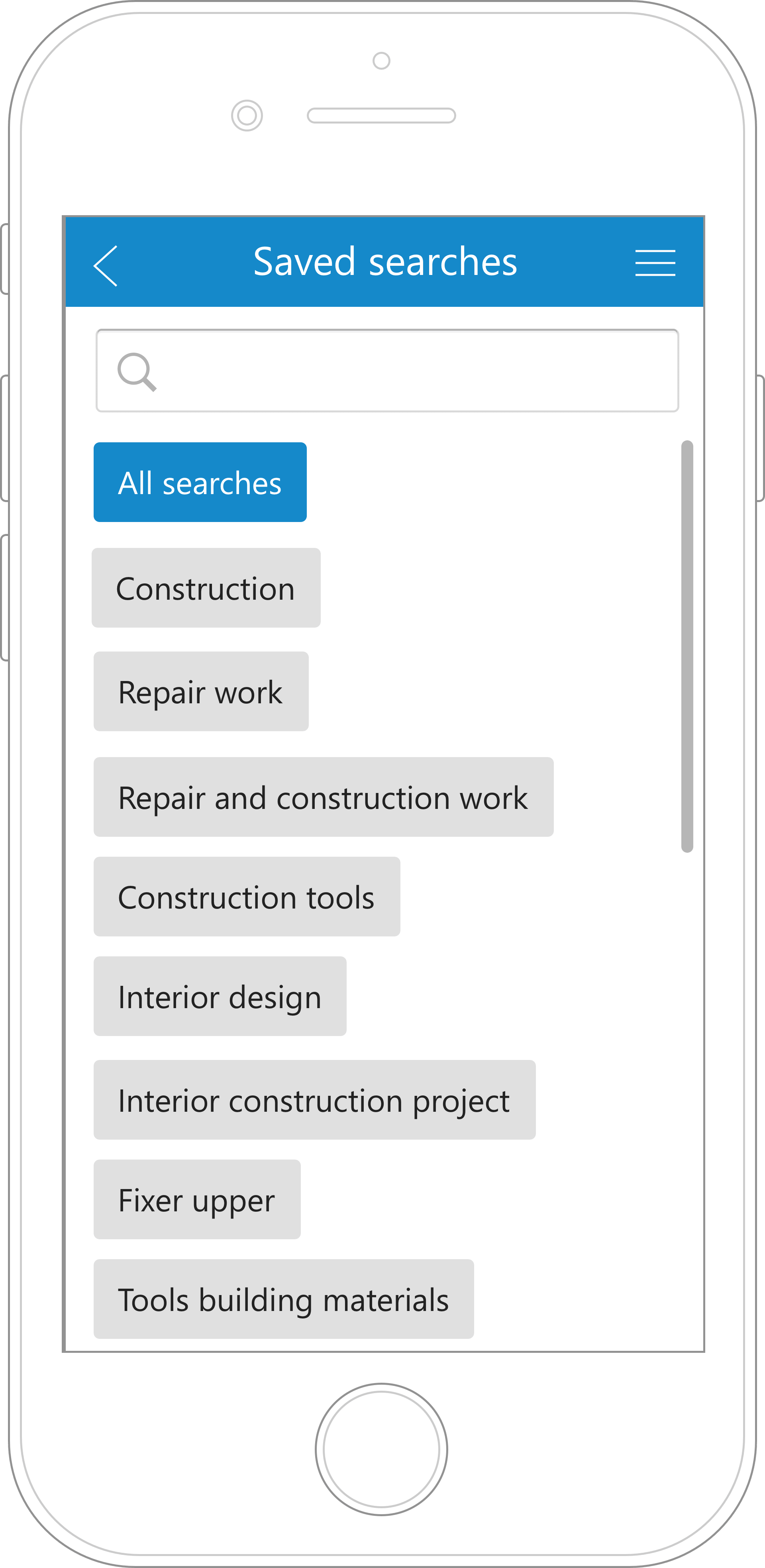
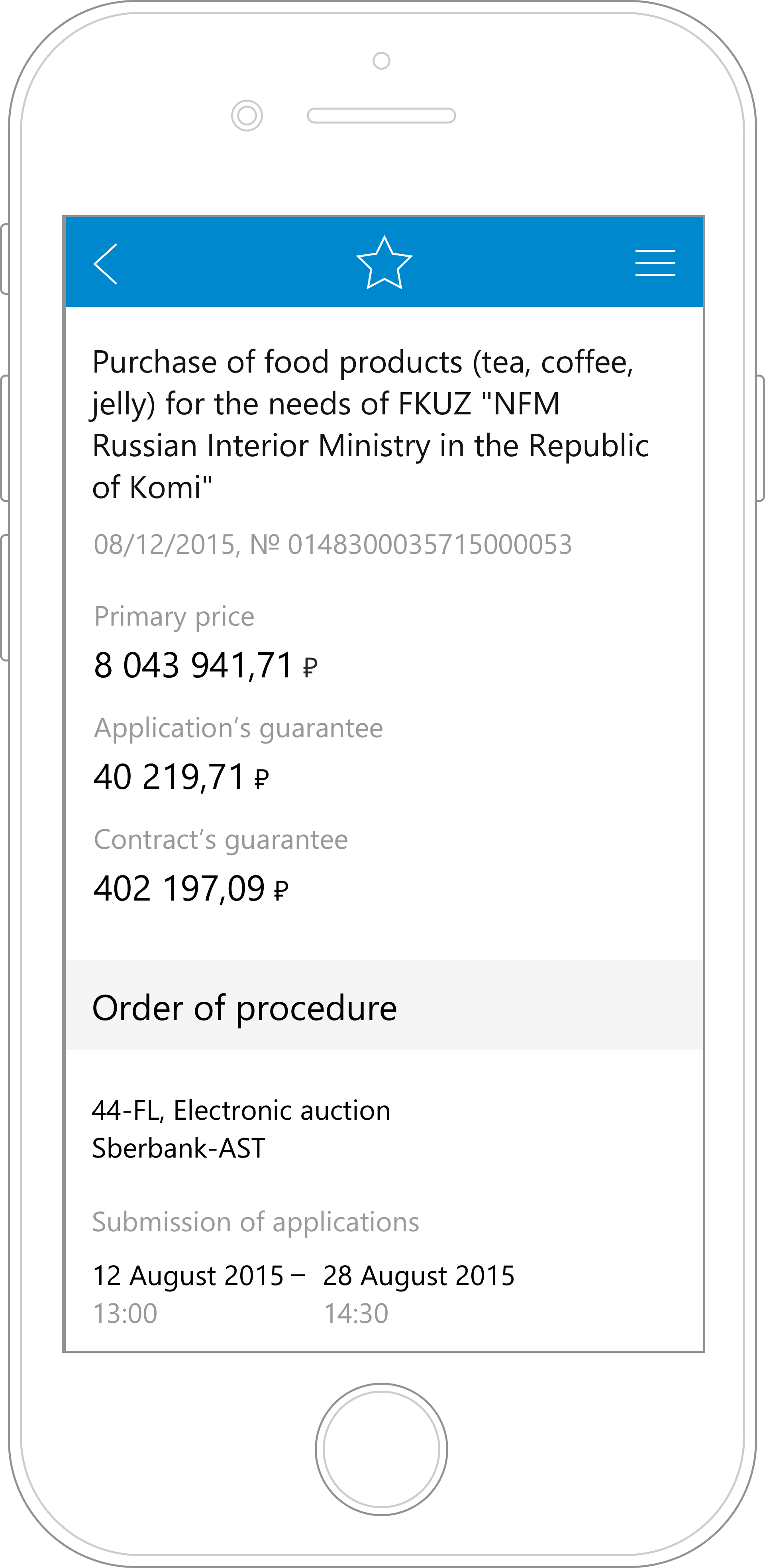
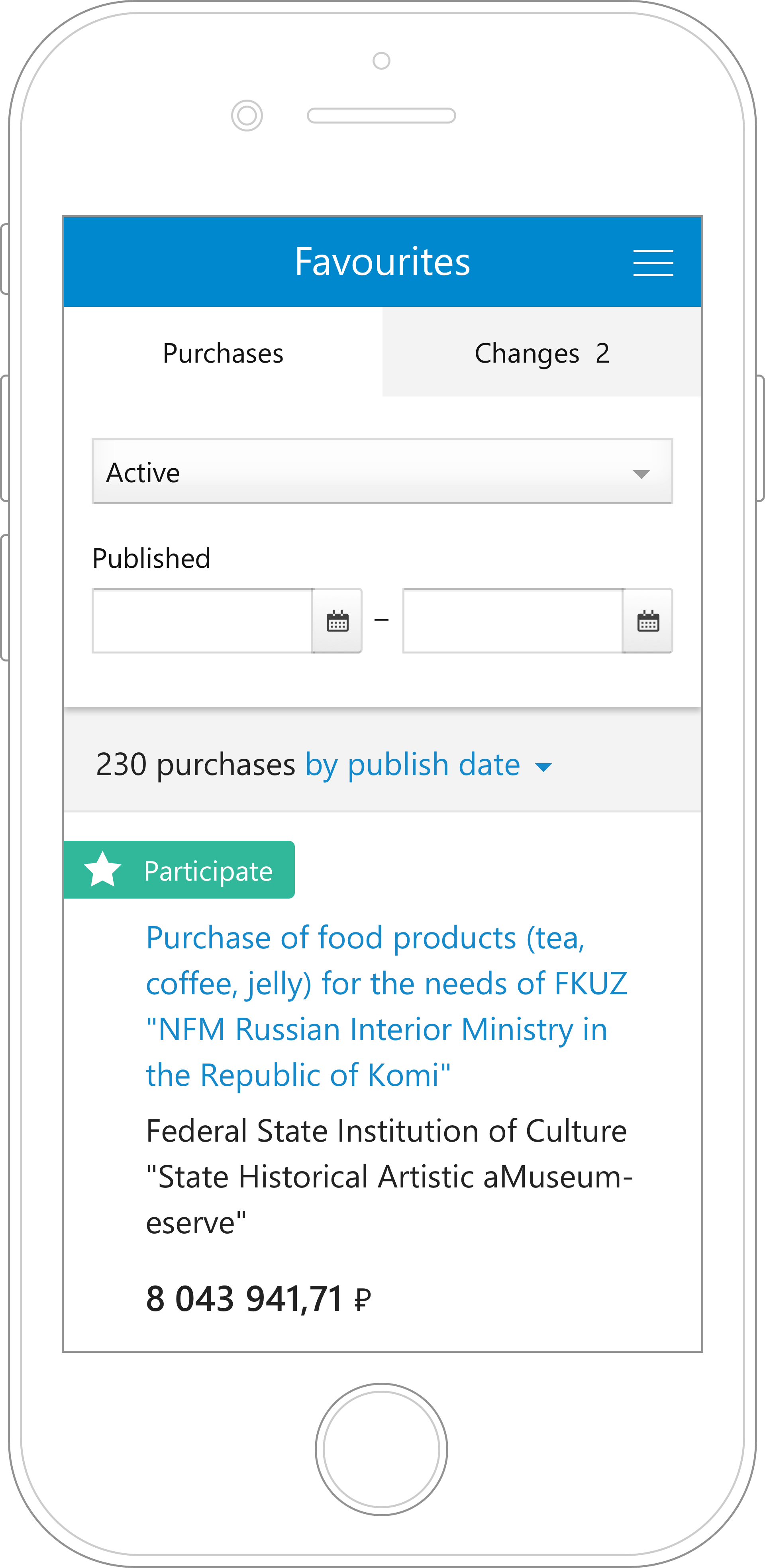
We decided to create a web app that aggregates auctions from different platforms and serves as a tool for suppliers to search and work with auctions.

Process and my role

We started with a small team of 5: a Project Manager, a Business Analyst, a UX Researcher, a Software Engineer, and me as a UI/UX Designer & Frontend Engineer. I led the project from the initial vision to 18k+ paid users. Eventually, I collaborated with engineering, marketing and sales teams, and partnered with another designer.

I helped in conducting user and competitive research, analyzing data, defining user personas and an MVP. Based on research, I iteratively created user flows, wireframes, interactive prototypes, visual design, and redlines. As I was the only designer for almost 3 years, everything you see below was designed by me.

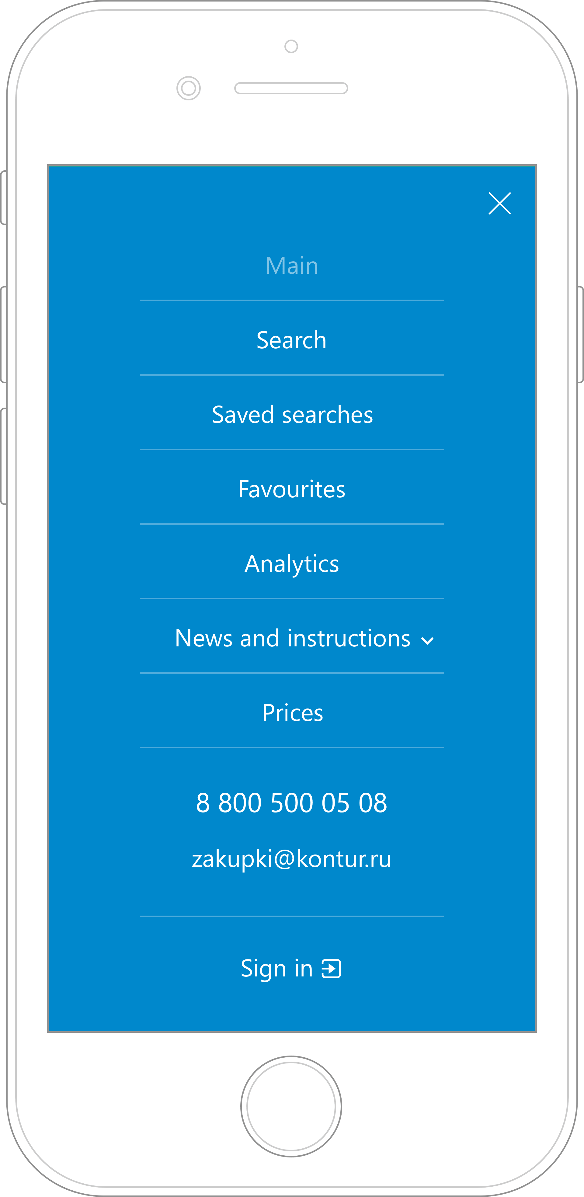
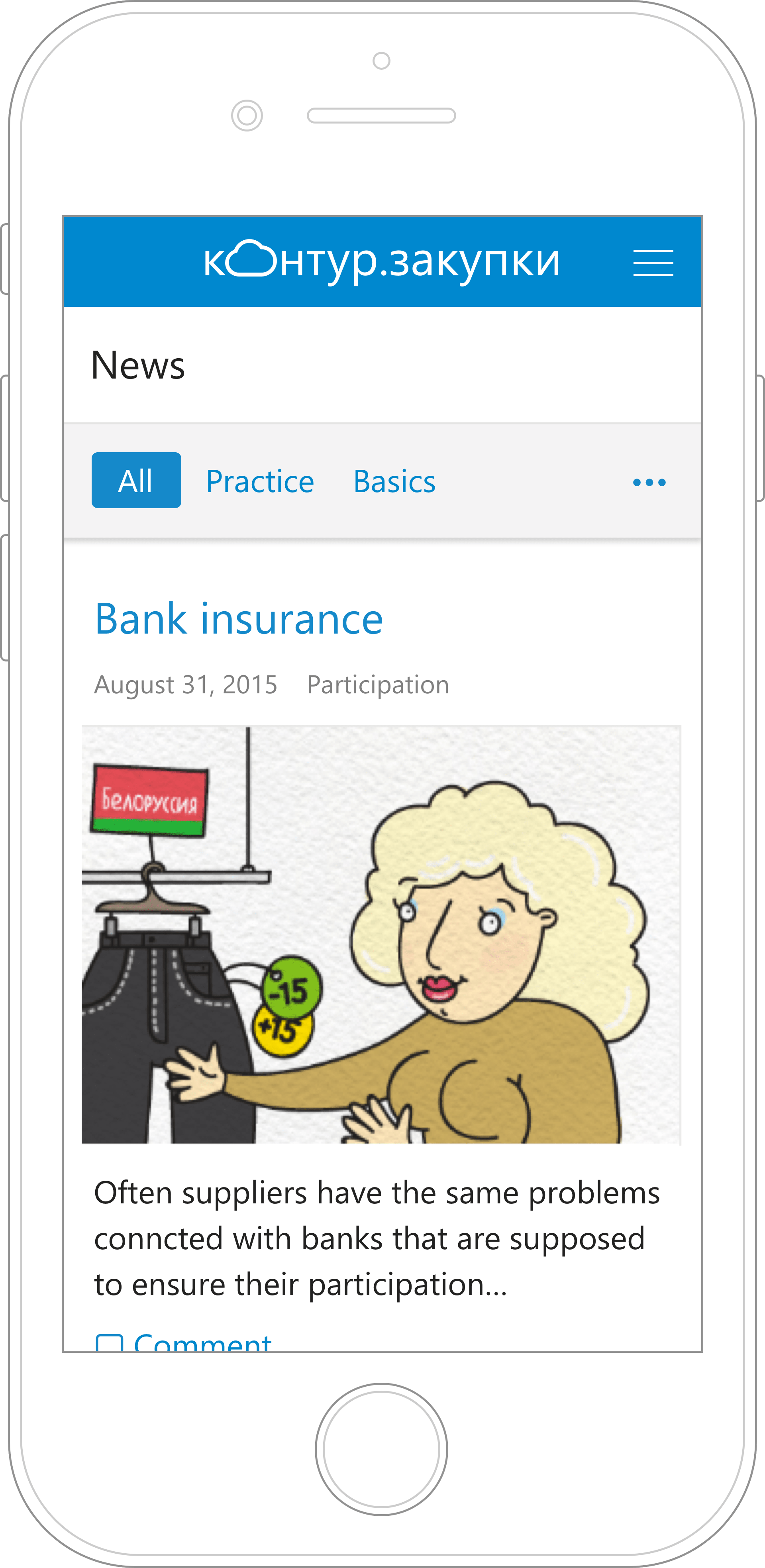
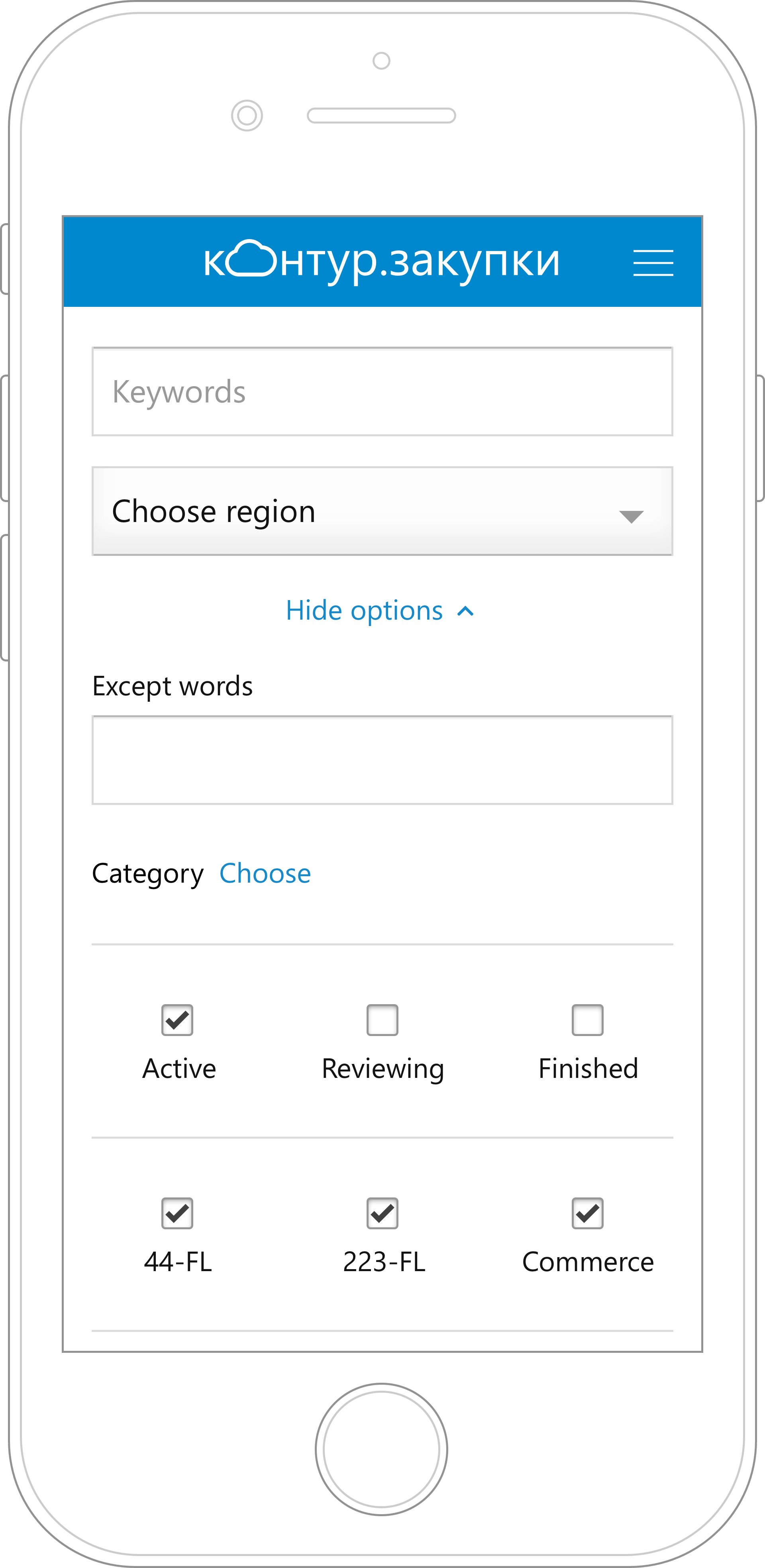
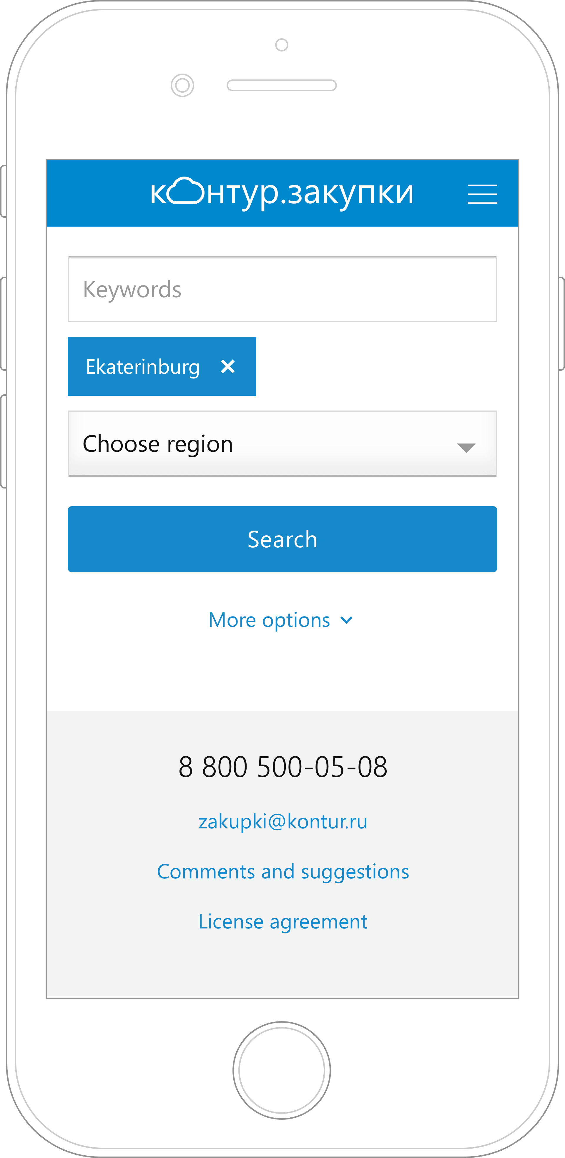
Jump to solution Product website

User process and problems

We started research with contextual interviews and usability testings of 3 competitors' websites. Research of existing solutions revealed problems on every step of the user process.

1.
Search for new auctions

Difficult search form, irrelevant results, repetitive search

3.
Prepare for participation

Manual storage of important auctions, unexpected changes to auctions' conditions, unclear collaboration with coworkers

5.
Analyze after

No analytics about customers and other suppliers

2.
Analyze before

Complicated and duplicated auction data, affiliation between customers and suppliers

4.
Participate

This part happens on special platforms

Based on research, we defined personas and created a huge user story map for the following year to see the potential course of our app. We started with the first step of user process and then iteratively research and moved forward covering the whole process.

Solution

User step 1 — Search for new auctions

Problem “Difficult search form”

Composing search requests took too much time because the form was too complicated.

Solution

Fewer search options, only important ones, prioritized visually. I made sure every new option brought value and the search form continued to be easy to use.

Result

Our form shortened the time of composing search requests approximately from 20 to 10 minutes.

The research showed that there were 2 search options that 90% users used every time — keywords and region. We launched our MVP with just these two options. Then we research other scenarios and iteratively added new options depending on their importance and frequency.

Problem “Results are hard to look through”

In other apps users struglled with too many irrelevant results. In addition, the results view didn't help to make a decision.

Solution

Engineers worked hard on a search engine. I designed resutls sorted by publish date and opportunity to sort results differently depending on a scenario. Based on research, I only showed the most important info.

Result

On user testings of the working app, we noticed that users found most of what they were looking for on the first two pages. They also could say right away if it's a potential auction for them.

This solution wasn't immediate. We had technical obstacles and I designed a compromise solution at first to give engineers time. It also allowed us to gather real search requests data to improve the search engine.

Problem “Repetitive search”

Users had to compose their regular search requests every single time.

Solution

We designed “Saved searches” to allow users to save regular requests and get notifications by email about new auctions.

Result

We saw in our metrics that users started to save their regular searches. In general, typical company had around 4-5 saved searches. One saved search request now took them one second instead of 1-3 minutes. After some redesign, users started to subscribe to notifications about new auctions as well. We noticed them entering the app through those emails.

I had to redesign the subscription process because we noticed that users were not subscribing as we expected. First, the subscribe button was only on the saved searches page. Instead, I added a subscribe checkbox when users were saving new search requests. The subscription rates went up.

User step 2 — Analyze before

Problem “Difficult auction data”

Because of the sophisticated legal jargon and overlapping content, users spent too much time on decision making and often needed external support.

Solution

I collaborated with a Business Analyst to unify auction data from different sources, simplify and prioritize it, and remove duplicates and multi-level structure.

Result

We did usability testings where asked users to find some information in the auction. It took them much less time to do it with our one page design than in other apps.

Problem “Possible affiliation between customers and suppliers”

Users couldn't check if they could trust customers and if the auction is legit.

Solution

I designed the whole flow for suppliers to check customers and uncover an affiliation.

Result

We measured clicks on auction pages that led to customer's analysis. Supplies indeed used it pretty often. To learn if our analytics was usful, we launched a poll among users that showed that it was. Some users requested additional info that we added later.

User step 3 — Prepare for participation

Problem “Manual work”

Users did a lot of manual work: they copied data from the website by hand, created Excel files, and combined it all into emails to share with their coworkers.

Solution

We created an online storage “Favorites” to make the work process and collaboration easier.

Result

We saw in the app how many auctions users started to save to work with them later. Users asked for more and more features. It looked like they were slowly moving their internal processes to our app. They commented on saved auctions, created different states for auctions and changed them.

Problem “Customers change conditions”

Customers often changed auction conditions and there wasn't any way to learn about it. In such situations, suppliers didn't know they needed to change their application documents and failed the auctions.

Solution

We found a way to automatically learn about changes and started to notify users about them.

Result

Users stopped spending time on a manually check while they were prepping for the auction. It eliminated situations when suppliers lost auctions because of the changed conditions.

Mobile version

After we subscribed our user to emails, we saw that 60% of openings were on mobile phones. Users went to view auctions from emails and had a terrible experience because the website was not mobile-friendly. Therefore, we created a mobile version for the screen with the list of auctions first and then for the whole site.

Other collaborations

Another important part of the project was making the whole auction process look easy. We simplified the legislation in our articles and kept users updated on constantly changing government rules.

To do that, we created “News and instructions” section on our website which in fact was a whole other website controlled by another team.

My role was to collaborate on integration and to create a flawless user flow so that users wouldn't be confused by two different websites. I worked on the information architecture, user flow, wireframes, user communication, articles, and emails.